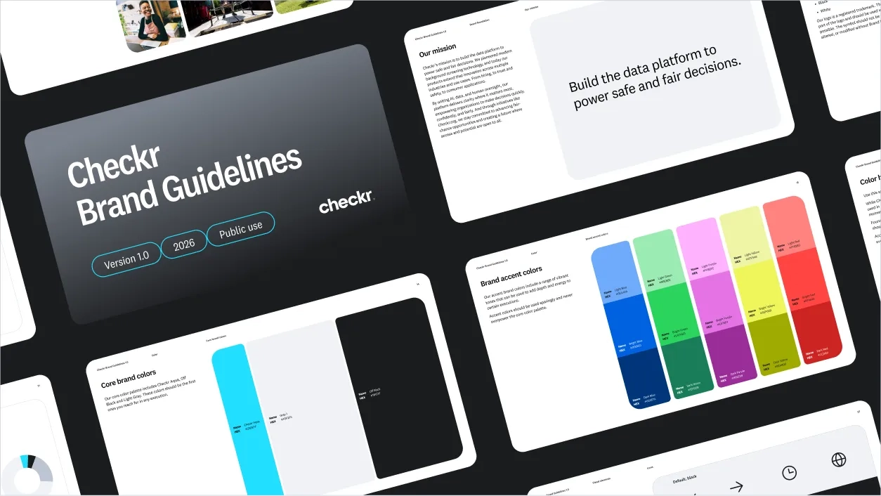
Checkr brand

Core creative concept

Clear

It’s a single idea that serves as the foundation of all brand experience.

As an adjective it means simple, transparent, unclouded. As a verb it means removing unwanted objects. It’s more than just a word. It informs and influences every decision we make—from visual design, user experience, customer service to tone of voice—it’s how we operate as a business.

Brand attributes

Our mission and brand framework guide our thinking and act as our internal operating system for decision making. We redefined our attributes to better align with the brand vision, and now we have an identity system that feels like it expresses our brand. A brand defined by our customers, their candidates, and our mission. One that communicates equally, no matter the tone or channel.

Fairness

We strongly believe in the principle of fairness, and we act accordingly. We believe that in our own way we can contribute to making the world a fairer place.

Intelligence

Checkr is built on intelligence. It powers our technology, streamlines our customers’ work processes, gets them better results, and lets them see candidates in a more nuanced light.

Approachability

We are easy to talk to. Even as AI, machine learning, and software guide and disrupt the industry as we know it, it’s still people that power us and set us apart.

Transparency

We strive for clarity and transparency in everything we do. We are transparent about our mission, our values and our goals. The benefits of our products are clear, and so is the way we communicate.

The Checkr logo

Our logo is an approachable lowercase wordmark, made from a clean and modern sans serif typeface. Through its simple forms, it is transparent, fair, and above all else, clear.

Logo usage

The Checkr logo can be used in aqua, navy or white.

To make sure the Checkr logo is legible at any size, we use 1 c’s width of space around the logo in all directions and never shrink it smaller than 29px on screen.

For use cases where the Checkr logo would be too small to read, use the Checkr monogram instead.

Photography

Our photography should always feel natural and human. Whether selecting from stock or a bespoke photoshoot, we pick images that fit our brand attributes and feature subjects in realistic, candid settings with natural light. When choosing photos, consider: diversity, authenticity, composition, lighting and subject matter.

Color

Our color system is where we let our personality shine. We use an expressive mix of vibrant secondary colors and ground them with our primary navy and aqua. Each color comes with a set of tonal variants, giving us a wide range of potential combinations and uses.

Typography

We use two typefaces, Argent and National 2, to express ourselves with approachability, professionalism, and clarity. By using Argent for headlines and National 2 for body copy, we give our layouts rhythm and hierarchy.

Looking for something else?

Content Style Guide

Reference this guide to create on-brand messages that sound clear and consistent across all teams and channels

Brand Studio

Have a question on best practices, guidelines, or need more information? We're here to help.

Press and media

Looking for Checkr in the press? Head over to our press page for more info.